Niklaus Troxler
Switzerland, with the support of The Swiss Arts Council Pro Helvetia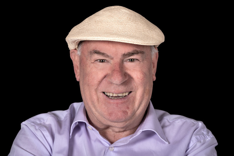
See also Personal exhibition on Typomania 2019
1947 born in Willisau/Switzerland.
Studied graphic design at Art School of Lucerne.
1972 Art Director in Paris.
Own graphic design studio since 1973 in Willisau.
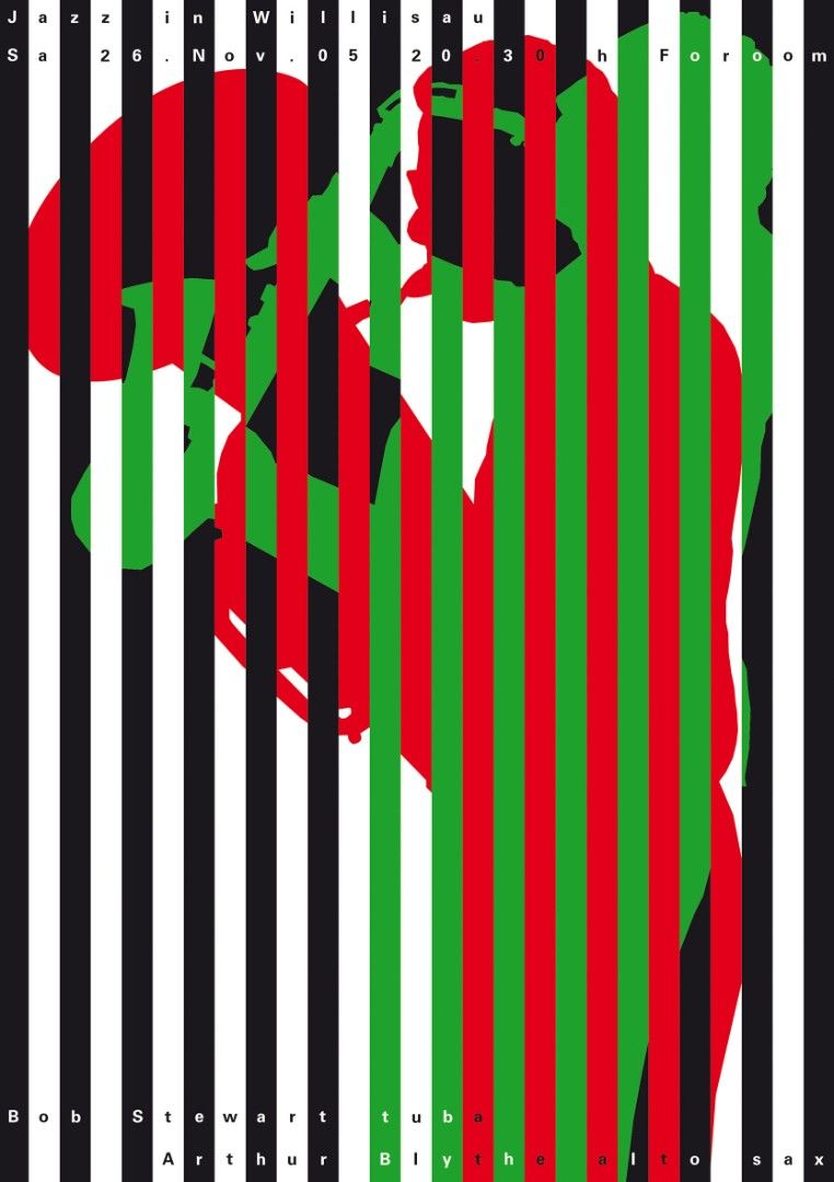
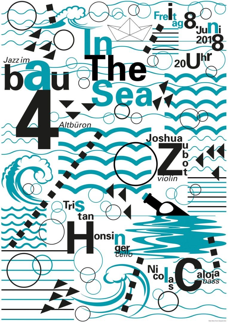
From 1966 to 2013 organizer of Jazz concerts in his home town Willisau, from 1975 to 2009 an annual Jazz Festival.
Cultural Award of Inner Switzerland 1982.
Honorary citizen of Willisau 1994.
From 1998 to 2013 Professor at State Academy for Art and Design in Stuttgart/Germany.
Winner of many national uand international design awards.
His posters are in the most important design collections and museums, at such as the Museum of Modern Art in New York, the Cooper Hewitt Smithsonian Design Museum New York, the Art Institute in Minneapolis, Stedelijk Museum in Amsterdam, Museum für Kunst und Gewerbe in Hamburg, the Bibliothèque Nationale in Paris, the poster collection of the State Museums of Berlin and the Design Museum in Zurich.
Important personal exhibitions in New York, Michigan, Minneapolis, Tokyo, Beijing, Hangzhou, Nanjing, Xi’an, Caracas, Mexico City, Paris, Pau, Marseille, Lissabon, Warschau, Berlin, Frankfurt, Stuttgart, Geneva, Zurich and Lucerne.
Since 1989 member of AGI Alliance Graphique Internationale.
Married with Ems Troxler. They have three daughters (Kathrin, Annik and Paula).
He lives in Willisau/Switzerland and Berlin.
Publications:
1999 Jazz Blvd. - Niklaus Troxler Posters, Verlag Lars Müller. ISBN 3-907044-90-8
2007 The Master of Design: Niklaus Troxler. PageOne Publishing. ISBN 981-245426-8
2007 Niklaus Troxler: Designer & Design. Pyramid, Paris. ISBN 978-2-35017-0541
2007 GGG book Nr 80, Dai Nippon Printing Company, ISBN 978-4-88752-365-4
2013 Willisau and All that Jazz, Till Schaap Edition, ISBN 978-3-03828-000-2
www.troxlerart.ch
www.willisaujazzarchive.ch
Статьи и интервью:
https://www.designindaba.com/videos/interviews/niklaus-troxler-all-jazz
https://eyeondesign.aiga.org/since-the-1960s-niklaus-troxler-has-been-improvising-with-letterforms-just-like-a-jazz-musician/
DESIGNING FOR MUSIC / Niklaus Troxler, Willisau/Switzerland
Music, more precise „Jazz“, is fascinating me since I was a young boy. The influence of Jazz in my poster design is enormous. I think everything that attracts me in Jazz music, I can transform in my Design: Rhythm, structure, sound, colour sound, interaction, composition, contrast, individuality, etc, etc.
I can say: My roots are in my record player!
The development of my interest in graphic design and Jazz went parallel.
I started designing posters for Jazz concerts in my earliest design years, let’s say during my study.
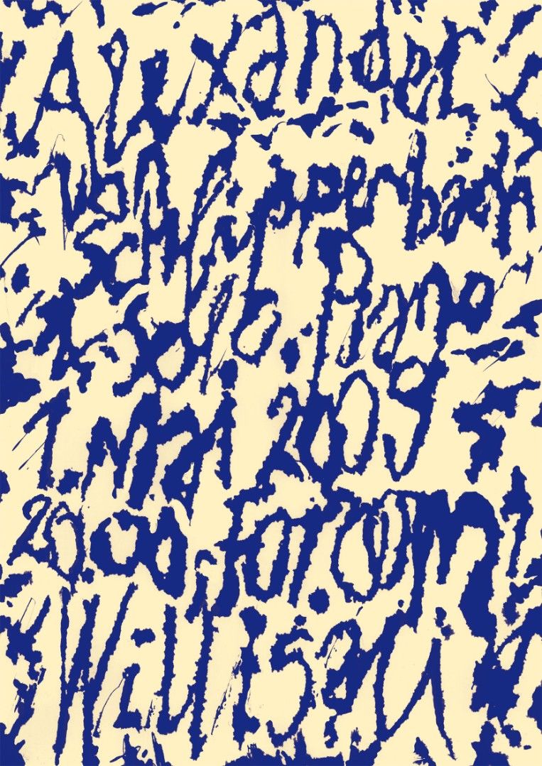
In the first period, I was always trying to find a metaphor for a specific music group. Later on, I was more interested in transforming the rhythms and sounds of the group. Today, I look more or less for structures in pictures and typography.
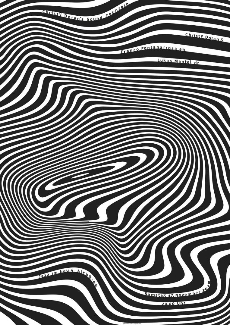
The main problem in designing for music ist he struggle with the static medium. My problem is to make the two dimensional media like a poster or a record/CD cover in a movement. Because music is always in a movement. It sounds, it’s floating. I always try to give my design a certain „moving“ and „sounding“ effect.
The vibrating vitality with which the musicians blow through their horns, play their drums on skins and pluck has to flow out of the crayons and colours. The black and white pattern of the keys of the piano, a glittering saxophone with ist branched out keys, these are standards which spark off the imagination, materials that stimulate creative design, just like logos, humas figures or clefs constatly stimulate new tunes, colours, and sound colours. Some musicians are more intellectual, some more eruptive, some more tropical. Exotical sensual like materials in which Afican women dance and play, colourful like bodypainting, magic chains sometimes, but nevertheless designs with more depth than meet the eye.
I always try to be as free as possible before starting a project. Wide awake yet as in trance, I use every motive and transform it, dreams it in the reality of my creative mind. I play with different elements of expressionism, surrealism, Pop Art, the concrete art, the graffiti artists, with negative-positive forms, with simultanious colours, with screens, with futuristic „multiple exposures“, in short with all means of expression of this day and age, and this in an unforseeable, suprising, elective way. Like musicians, unconcerned with the piece played an with whom, whether for a record cover, a postcard or a poster, I’m always playing myself. My poster has to be music, my instrument is graphic art, my field is the poster format and yet it is far greater that that. I try to belong to the group like the man at the mixer. I play the visual part of a piece and even give solos. As „preamplifier“ outside the concert hall, I make street music so that sound reaches the right ears, put people in the mood fort the acoustic event and echoes on as long as the image remains in the memory.
ZAGREB.3/2012
— How do you see connection between design and jazz?
When I started to study Graphic Design, I was already a Jazz enthousiastic. So, I started organizing jazz concerts when I was 19 years old. It went always hand in hand – my development in graphic design and the jazz.
— Do you play some instrument, just for your soul?
I learned playing trumpet, later I changed to trombone and tuba. But with 30 year, I quit playing. Since then I do it just for fun on carnival.
— Is it hard, for a creative designer to organize jazz festival?
It was always great pleasure! It’s hard work of course: searching for sponsors, doing the program, contact the agencies and the artists, planning the infrastructions etc, etc – and the design. But the design is the smallest part in the job as a Festival director.
— Why did you come back from Pariz to Willisau, your home town?
I already organized jazz concerts in my home town Willisau, when I stayed in Paris. And I went on organizing concerts during my stay in Paris. I made a lot of contacts to musicians there. But it was clear – I wanted to open my own business in my home town Willisau and I had to go on organizing conerts. Then, in 1975 – I started my four day Jazz Festival, which became very famous in the international jazz scene. After 35 Festivals, I gave it over to my nevew Arno Troxler, while I go on organizing single jazz concerts during the year.
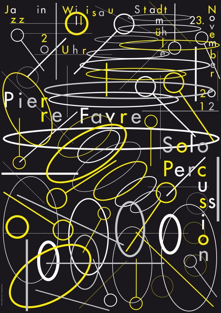
The posters and graphic design for the festival are designed by my daughters Annik and Paula.
— What this jazz festival means for your town?
It is very important for the town, because that festival brought Willisau on the map! Year by year great national and international media presence and a lot of visitors in our town.
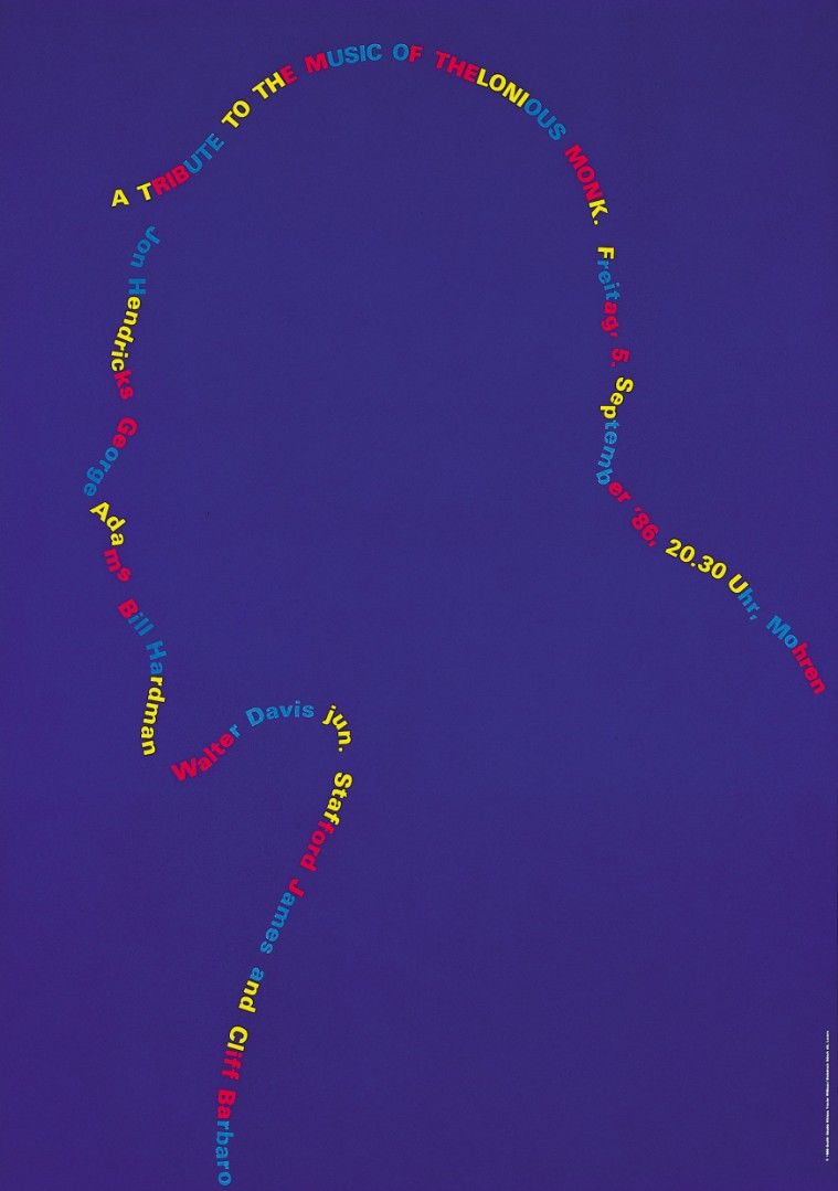
— Your work Tribute toThelonious Monk is actually visualisation of his famous composition “Round About Midnight”?
That’s true: I wanted to visualize my favourite composition of Monk in the poster design. After many many sketchings and drawings of Monk’s portrait, I arrived at that solution with just type.
— Your posters for a jazz festival are always the same size. Why?
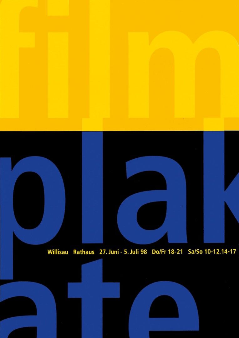
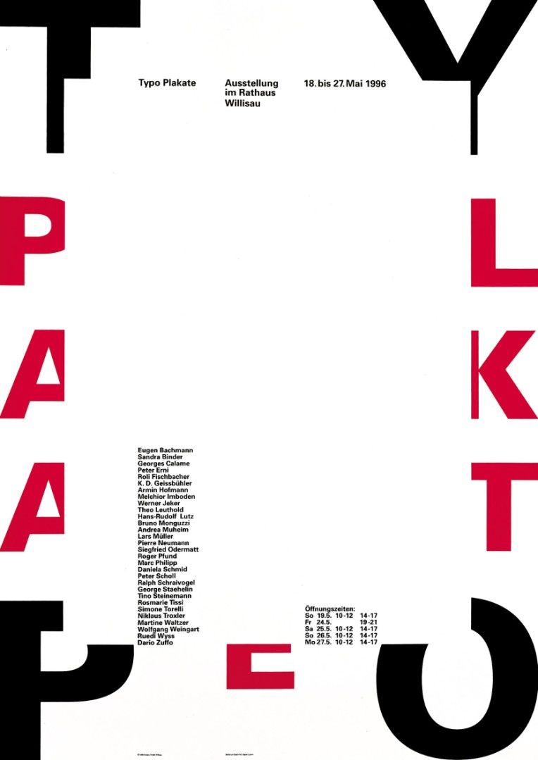
In Switzerland, we have “official” sizes in posters. The normal single poster size is the so called “World format”, with the measures 90 x 128 cm. A funny word for a poster, which is used only in Switzerland. But in poster design, Swiss mean that we are really “world format”…There is also the triple size very used.
— I have read somewhere that you think that using photography in design is cliché. I like that…
Well, when I started designing posters, there were so many designers who just used photographs and typography. I just wanted to use the tools I had in my studio — and what I really could do myself.
— Is it hard to find a new tipograpy?
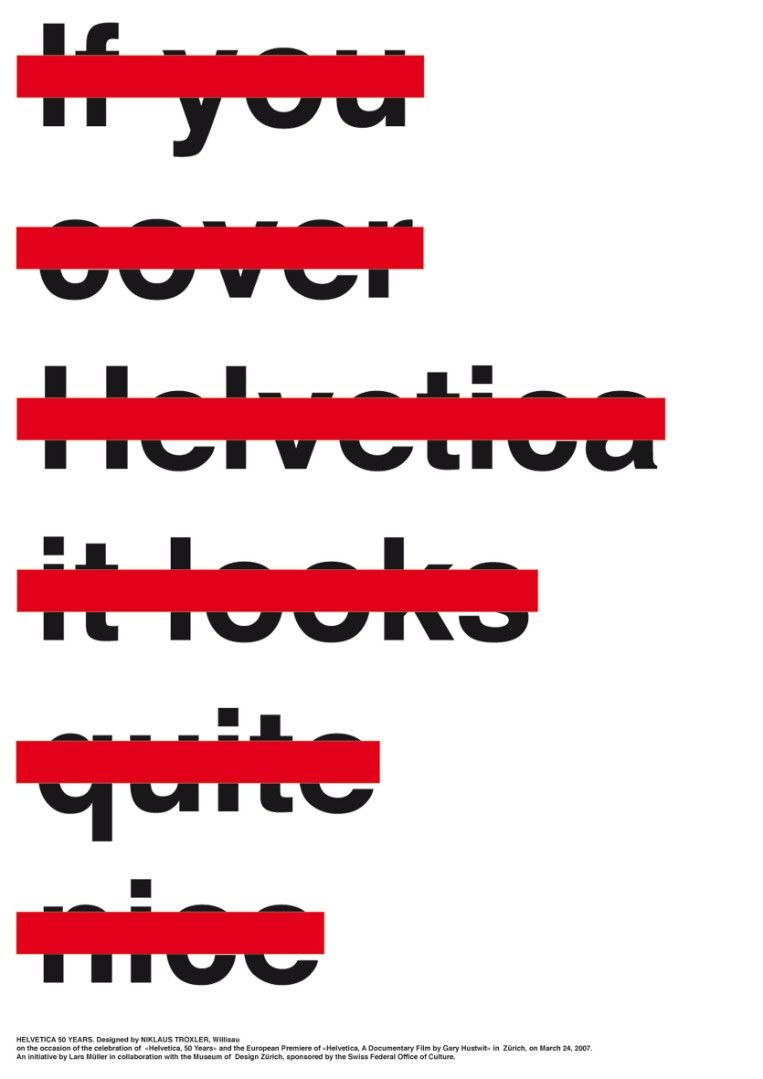
I think typography is an endless game. To play with type is great fun. And to design has to make fun…
— Are you following tradition of Swiss design? I have read that you stated that in your art is as much pop art, swiss design tradition, music, all mixed up?
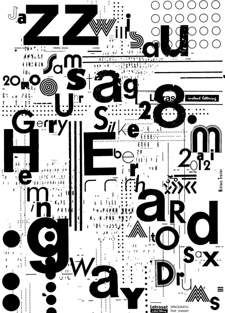
I have to say that when I started to work as a designer, the so called “Swiss Style” was very powerful. I wanted to look not as a typical Swiss designer. I used cracy type caracters which I got from “Letraset”. I was more impressed by the Pop Art of that time and from the handmade Polish Posters.
— You have started to listen jazz since when you are little?
I started listening to jazz with about 14 years. But I was also enthousiastic about The powerful Rock of the late Sixties and Seventies. The Jazz I like is not “strictly Jazz”, but is a individual music more at the edges to Rock, Classic or Free Improvisation.
— How important is street context, when it is about public posters?
The poster is a fantastic media. It just contact the passers by in the streets. Nobody goes into the streets to look at posters. But once a poster reeches you, it’s great efford. A interesting poster is a surprising moment in the streets. And they change week by week. What a wonderful gallery in the streets!
— What is difference between design when you started this job, and today?
Design always has to reflect the time! That’s very important. I cannot go back to my design from the Seventies or Eighties – because it’s another time today! I live and work NOW, that’s important, with the codes and signs of today. I’m influenced by the time, that’s all important. It has not do with “style”, but with reflection. I think as a designer I have to reflect the time in a very personal way.
— You are coming to Zagreb, to give a lecture. What will be the topic? What does for you ZGRAF awars means?
It’s great pleasure to come to Zagreb. I have been there in 1969, when I took a train trip from Switzerland to Istanbul, with many, many stops in different cities. I remember well that time and I’m looking forward to see the city now. In my lecture I go to show a series of my posters from the beginning up to today. I will talk about how I was looking for ideas, how I developed my way to desing. And so on.
Vision and Sound - Niklaus Troxler Posters
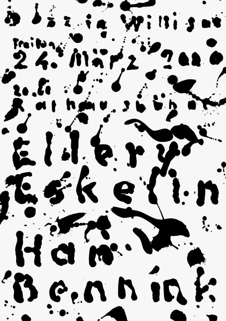
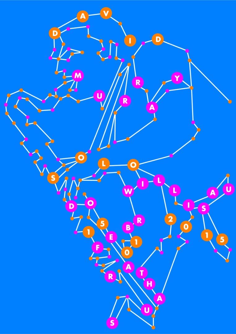
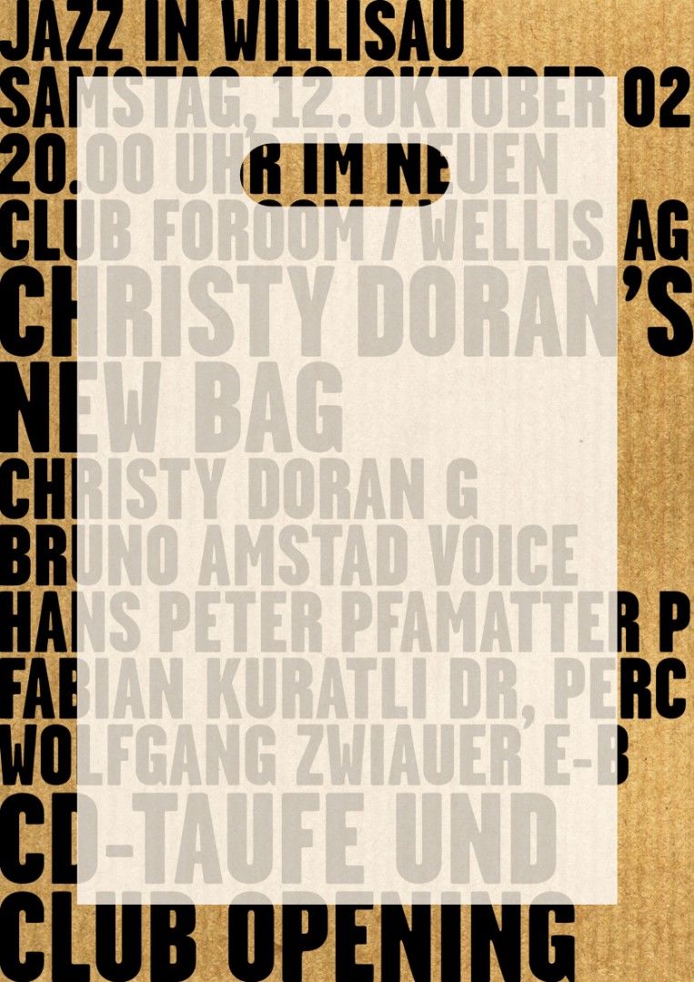
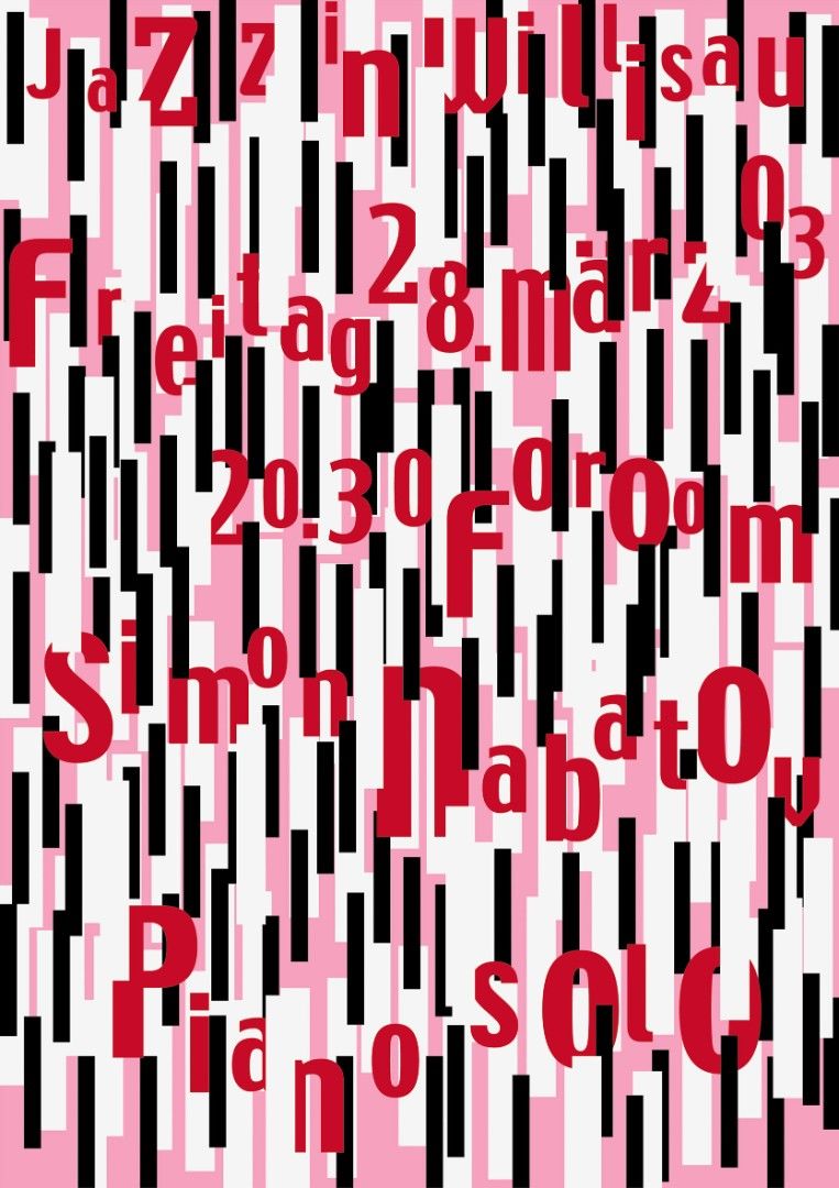
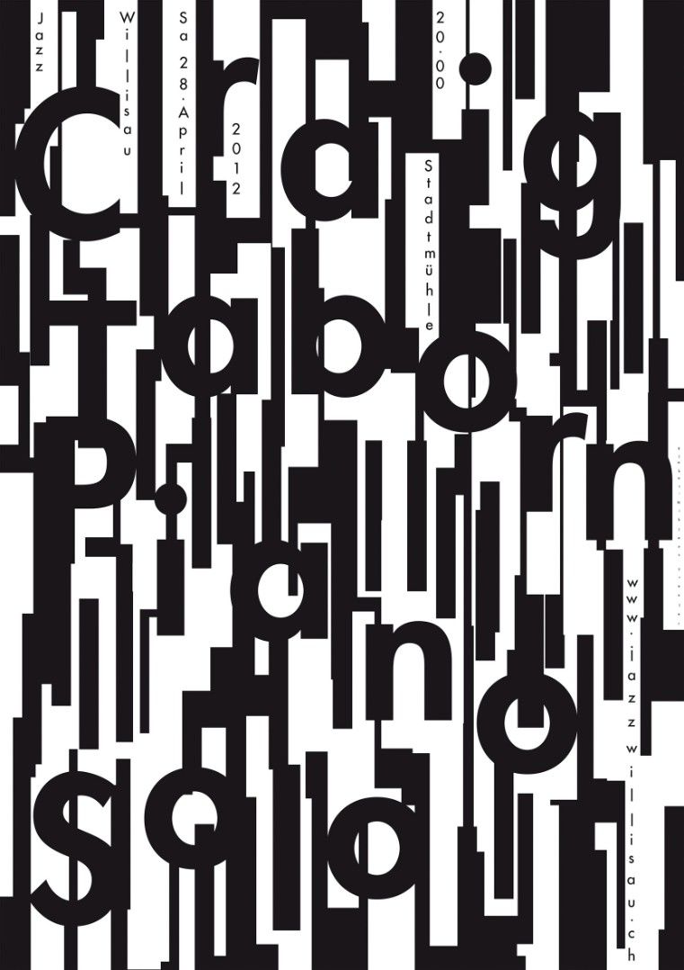
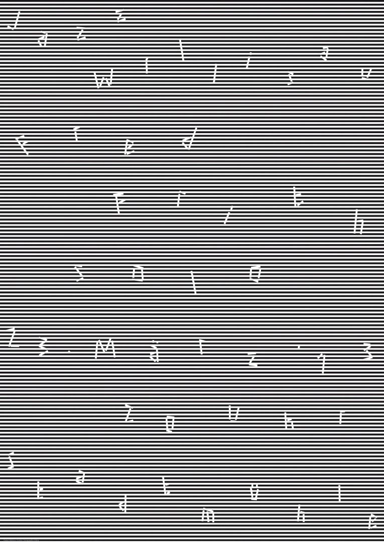
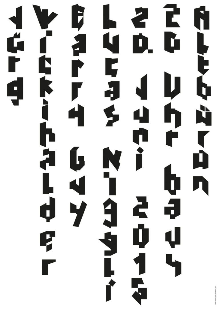
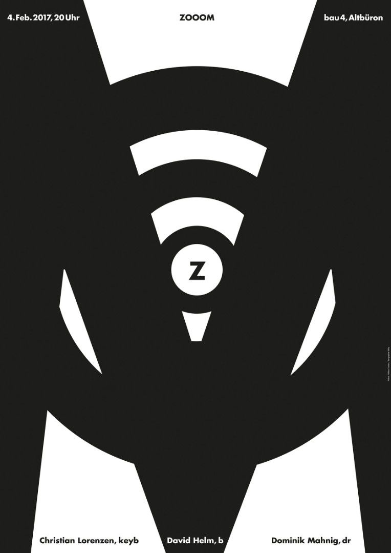
Niklaus Troxler acquired his artistic reputation through his jazz concert posters; it is on music that his creative genius was nurtured. To Troxler, music and imagery go hand in hand. His posters represent the result of a dialogue between two elements, vision and sound. Each work is a visual expression of the music which it illustrates; the artist's goal is to show us visually what we can perceive acoustically. Though made with great care and precision, Troxler's jazz posters invariably reveal a spontaneous and improvisational character that mirrors the mood of the music for which they have brought him, jazz posters are only one of Troxler's strengths. In fact he creates posters on a wealth of themes, including consumer goods, cultural events, exhibitions and shows.
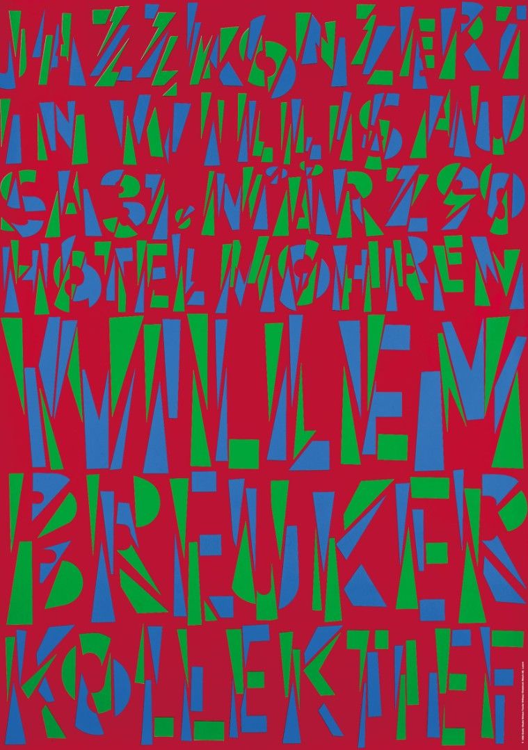
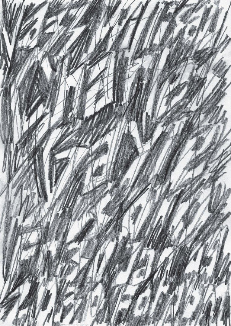
Troxler developed his unique style - direct, vibrant, expressive - early on. It is a style that is readily recognized in the colours which he employs: colours which are vivid, alive and always pure. They attack us, but not by force, rather attracting our attention with their frank directness. As most of Troxler's posters relate to jazz, his motifs are often similar: saxophones, pianos, hands, bodies in motion, brids, national flags. Such is the alphabet which Troxler uses to express himself. It is his creative genius - and the pleasure which he takes in his artistic games - that enables him to produce infinite variations on themes which are often fundamentally alike.
Stylistically, Troxler does not belong to any one school. His aim is simply to lure the viewer away from his daily routine and offer him an entertaining distraction. It is no surprise t note that Troxler was influenced gratly by Herbert Leupin, an artist whose goal was always to speak to the man in the street, to set up a rapport between poster and passerby. Troxler follows the same path: like Leupin he seeks to charm, to astonish and to provoke.
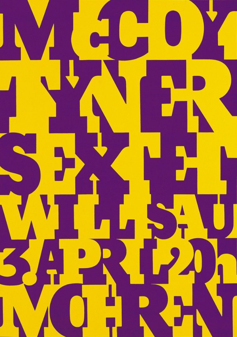
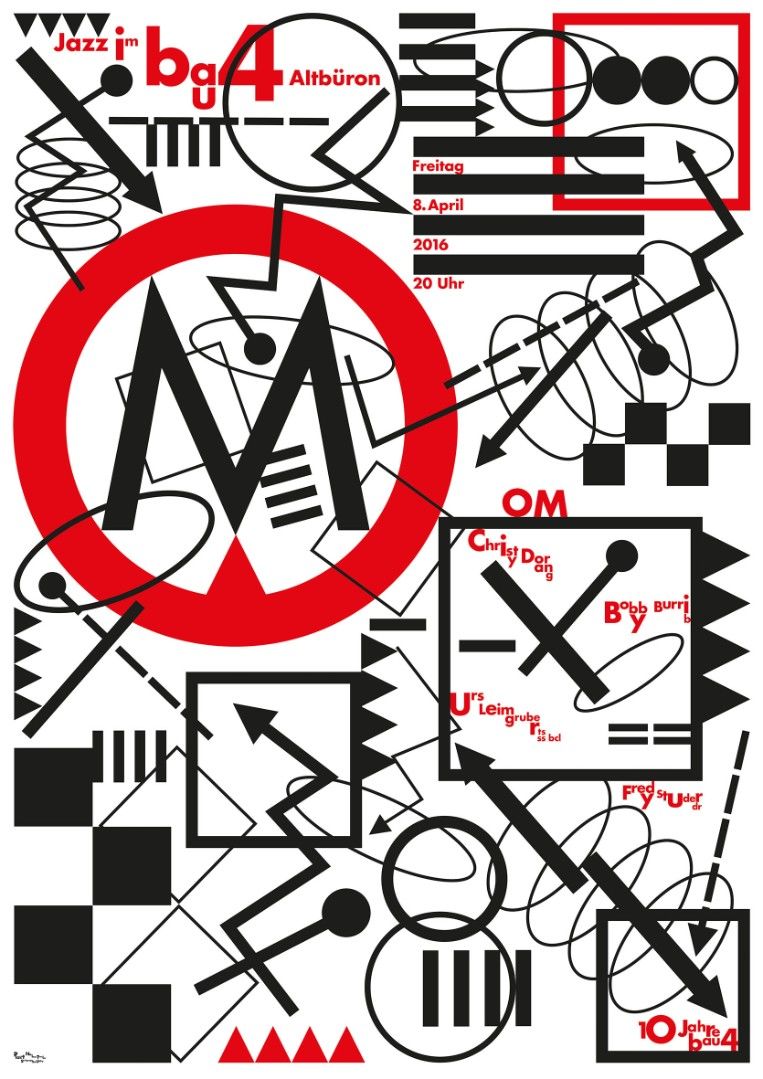
Tracing back to the 1970s and 80's, Troxler's work can be divided into a number of stylistic periods. At various times he has fallen under the influence of surrealism, pop art, a surprising blend of these two (his poster for pianist Cecil Taylor=, or pure typography (his posters for the McCoy Tyner Sextet and for Thelonious Monk). In the 1980'2 he introduced a style even more tense and disjointed, rapid and rhythmic, almost graffiti-like. Then in the 1990's he began adopting a more mechanical view of humanity, using strokes that call to mind the geometry of information signs. But at the same time, being a born experimentalist, he also took to creating new posters of a more pictorial, spontaneous ilk. Though every phase Troxler has been rigidly consistent in one matter: he always insists on creating his posters in his own studio, alone, without outside assistance.
A poster created by Troxler for a one-man show in 1991 perhaps epitomizes the effect which he is ultimately seeking. In it, coloured circles bring our focus of attention toward the center, while at the same time they explore outward toward the perimeter, as if wanting to take possession of the surrounding space. The poster is Troxler's portrayal of movement, of vibration, in other words, his portrayal of life itself.
Catherine Bürer
Former curator of the poster collection of the Design Museum Zurich